PACER CENTER
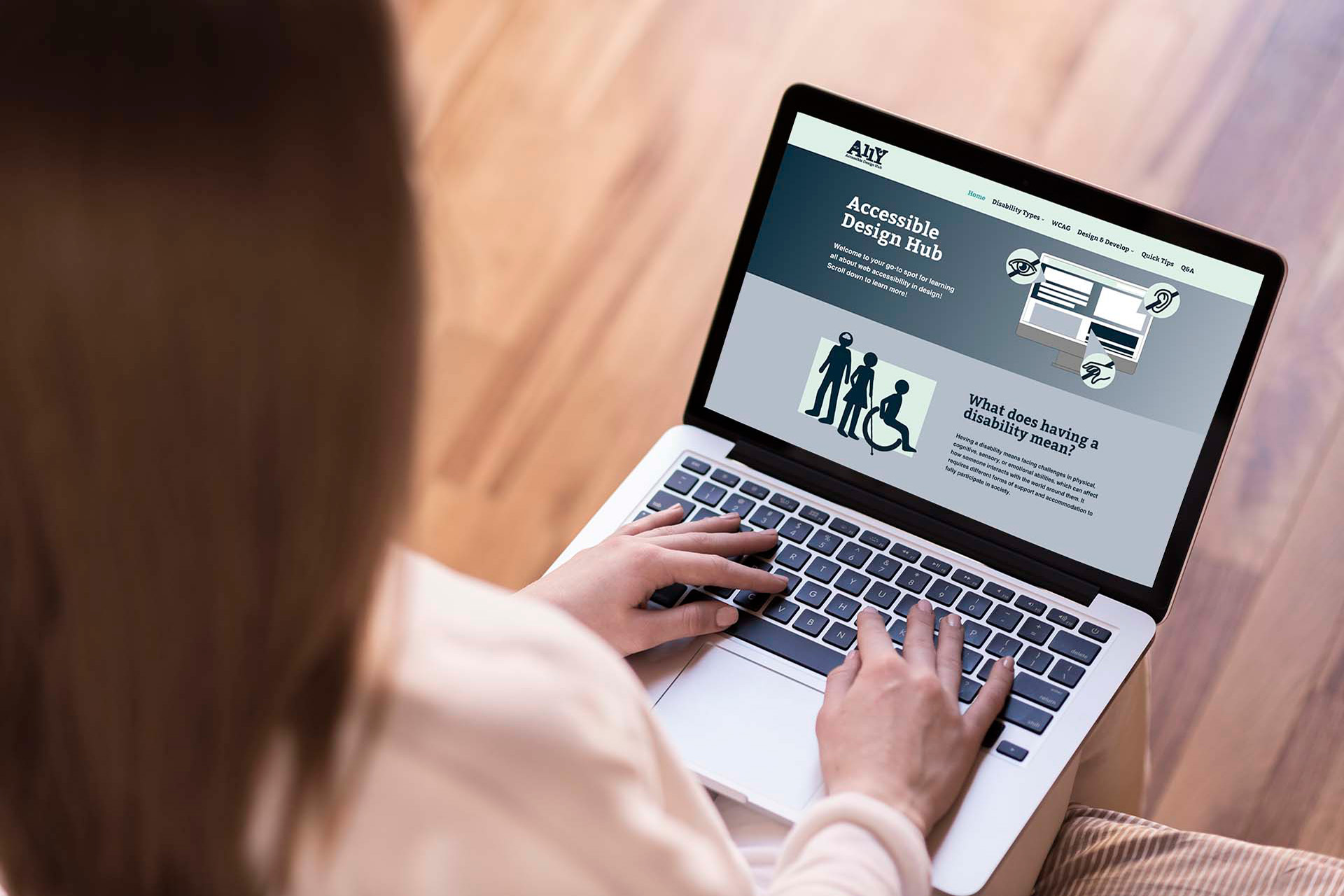
The PACER Center website redesign aimed to create a more accessible, user-friendly, and visually engaging platform to better serve children with disabilities, their families, and the professionals who support them. The project focused on improving navigation, enhancing readability, and aligning the visual design with the organization's mission. Key goals included expanding accessibility features and creating a more inclusive digital experience for all users.
2025
UI/UX WEB DESIGN
BRAND IDENTITY
ICON DESIGN

MY ROLE - Solo Web Designer
As the designer, I was responsible for conducting research, user testing, creating sketches, wireframes, a style guide, and final design and prototype.
PROJECT OVERVIEW
I was tasked to research a Minnesota-based non-profit organization that was in need of a website redesign. I researched the Minnesota-based PACER Center and redesigned their website layout to create a smoother, more accessible user experience, focusing on clearer navigation, better content organization, and improved mobile responsiveness.
PROBLEMS
I wanted to solve the inconsistencies on the current website involving:
- Visual clutter and density
- Poor visual hierarchy
- Navigation and flow issues
- Outdated visual style
- Accessibility concerns.
GOALS
- Enhance user experience: Create a clean, intuitive layout with clear navigation to help users find information quickly.
- Improve accessibility: Ensure the site is fully accessible to users of all abilities.
- Modernize Visual Design: Refresh the look with a professional, clean, welcoming look that reflects the organization’s mission.
- Simplify Content Structure: Organize information logically with a strong visual hierarchy.
- Increase Engagement with Clear Calls to Action by highlighting key actions like donating, volunteering, or attending events and programs.

PRELIMINARY RESEARCH PROCESS
After choosing the non-profit organization, I first researched and created three competitive benchmarks for similar organizations, and annotated aspects of their designs that worked well, and those that didn't. I then conducted an audit and user testing on the existing Pacer Center website to determine which aspects of the website caused problems with users.

I then conducted an audit and user testing on the existing Pacer Center website to determine which aspects of the website caused problems with users


Consumer Personas
After doing these rounds of research, I created three user personas to represent people who might visit the PACER Center website. This in turn helps me better understand their needs, goals, and frustrations, and keep them in mind throughout the design process.


User Stories and Flow
After doing so, I created numerous user stories to get a clear idea of all the possible needs and journeys these consumers might take. After doing these user stories, I turned them into user flows, to visuals which the pages the user would navigate to in order to find answers.

Wireframes
I then took all of the information I gathered to create sketched and digitized wireframes to reflect a layout that would concisely solve all of the issues I found, as well as meet the needs of the consumers.


Wireframes User Testing
After creating prototype wireframes, I conducted another user testing to see if my layout idea was implemented effectively enough to create a clean user experience to satisfy their needs.


Final Design
I then improved the layout design based on my user feedback and began taking what I had learned throughout my research process and turning it into a design system and final website design. After I had finalized a design, I conducted one last user testing in order to determine any last changes that needed to be made to my website in order to create the most efficient user experience possible.


KEY TAKEAWAYS
- Accessibility Must Be Built-In, Not Added On
Designing for all users from the start of the design process is very important to keep in mind. Especially when designing for a site where part of the target market is disabled individuals. This leads to an inclusive and effective site overall.
- Content Hierarchy Matters More Than You Think
Things such as clear headings, structured layouts, and certain visual cues can help improve the engagement that a user has with a website and assist them in understanding the website.
- Simplicity Drives Usability
Removing clutter and large blocks of text can help the user focus on the truly important information. It also helps the user focus on their needs making navigation more intuitive and helping users find key information faster.
- Design Decisions Should Be Backed by Research
Researching, testing, and analysis, audits, and edits are essential for improvement and keeping the website cohesive to the users needs.
Check Out My Other Works!